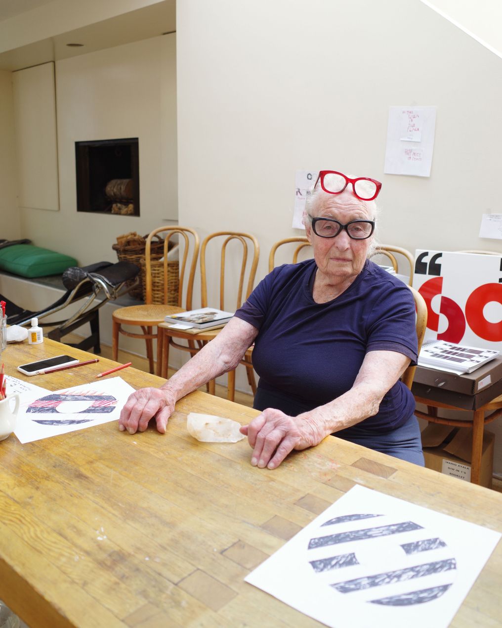
Making the invisible visible — in the legendary graphic designer and artist's final published conversation, Barbara Stauffacher Solomon discusses her love of Dieter Roth's 1234 Most Speedy Drawings and her lifelong pursuit of the unseen.
Editor's note: An early version of this feature was originally shared in the very first issue of The Édit, our newsletter, launched in September of 2023. We had only weeks earlier solidified our plans to begin publishing, prepared with only a boilerplate prompt and a list of 50+ potential contributors we wanted to contact. Through a series of correspondences that now feel miraculous in hindsight, ‘Bobbie’ was the first person to respond. Our gratitude to Chris Grunder for his help with this story, Bobbie's late-life best friend and de facto studio manager.
Barbara Stauffacher Solomon (1928-2024) is an American graphic designer and artist. She is best known for her large-scale interior supergraphics and exterior signage at Sea Ranch—a private estate with a utopian vision in Sonoma County, California—but her work, spanning more than 70 years of output, has taken a multitude of forms.
Along the timeline of an astounding 70-year-long career, her work at Sea Ranch was nothing short of groundbreaking, transforming the coastal property into an architectural and visual landmark using only cost-effective house paint to bring her perception-altering vision to life. Her interventions made the boundaries between architecture, graphic design and landscape feel porous, giving way to a new understanding of spatial decoration.
Notable also is her use of the Swiss International Style and Neue Haas Grotesk [or Helvetica as it came to be known] in the development of the facility’s signage system, at a time when typography on the west San Francisco was either stuffy and traditional or folksy and hallucinogen-inflected, even predating major American projects with similar Swiss DNA such as Massimo Vignelli’s much-vaunted plan for the New York Subway System. For a time she worked at Vignelli's NYC office, an experience which ultimately led her to head West and open a firm of her own in San Francisco. (There are off-record stories from Bobbie we won't recount here, but if you ever run into us on the street we're happy to share.)
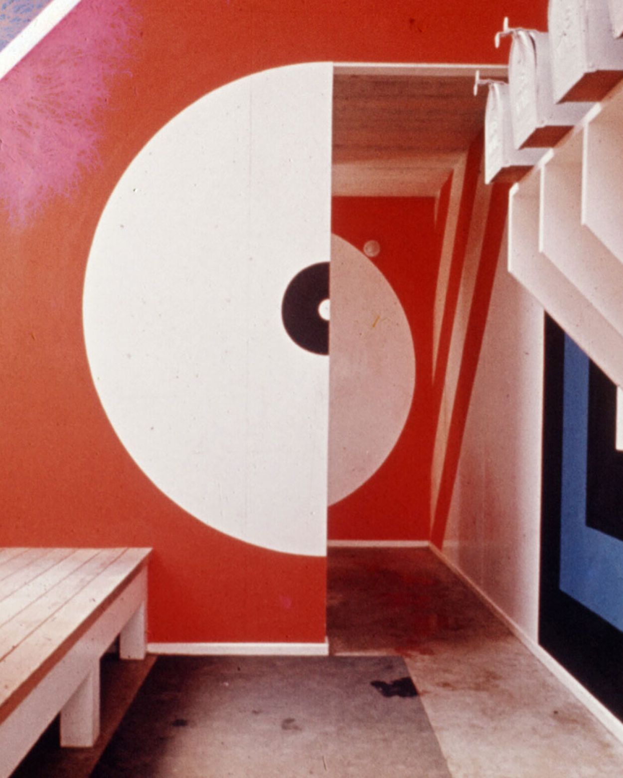
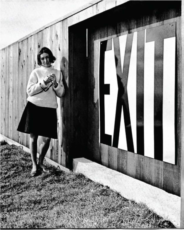
Thankfully, much of Barbara's work can actually be seen, whether at SFMOMA or Sea Ranch, or at the 68th Street Six Train entrance in Manhattan. In conversation with Éditions, however, her inspiration lies in a world that can't be easily be photographed, linked or even described. To help us get closer to understand the intangible things she's spent 80+ years chasing, Bobbie shared a vanishingly rare title from her extensive library that captured her attention not just for its scant availability and unusual provenance, but for its metaphysical allure and totemic power—a connection to the unseen world.
‘The book I love the most right now is Dieter Roth’s 1234 Schnellstzeichnungen or 1234 most speedy drawings. It's exactly what it says it is: one-thousand-two-hundred-thirty-four drawings on just as many pages, numbered and in order. The drawings are these strange little flourishes, you can see!'
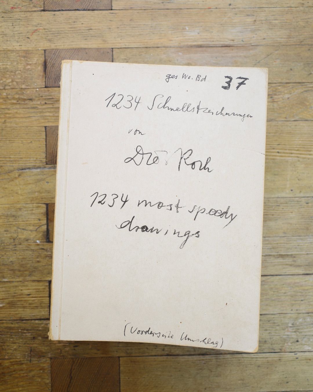
Despite its size, the book itself is incredibly difficult to find or see in person or online, let alone purchase, now retailing for thousands of dollars (if you can track one down). Dieter Roth published the book in 1987 with instructions: ‘Don’t forget or repress to stamp the most into the speedy drawings.’
According to an Artforum article from the same year, the artist intended for the title not only to be a description of the book’s contents—quite literally one-thousand-two-hundred-thirty-four quickly executed drawings—but as a direction for the reader. You move through the book quickly, each image causing the previous to be forgotten immediately, creating a propulsive energy that takes you quickly through this would-be weighty tome.
According to the same article, more than 25 years prior Roth wrote about this same idea in principle — ‘Instead of showing quality (surprising quality) we show quantity (surprising quantity).’
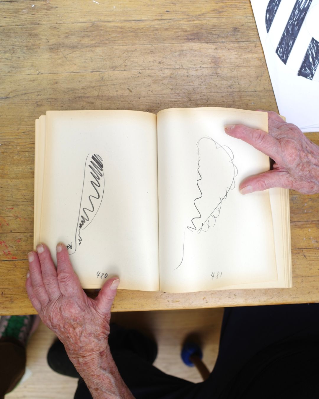
Bobbie of course recognized and appreciated this conceptual framework of in her assessment of the book, and gravitated to it for this reason, as both an object and an experience. ‘The book is about nothing, it’s almost invisible,’ she said, captivatingly, ‘A big, huge, invisible book… it’s DIVINE.’ And if the previous thought weren’t spellbinding enough, she added last: ‘If I'd have gotten a PhD, it would have been in the invisible.’
Bobbie's final book—aptly entitled Invisible—captures her personal investigations into the unseen and unseeable. Prior to its release, she published Making the Invisible Visible, a series of lyrical essays on nothingness, propaganda, homogeneity, and other things related to invisibility. Her seven-decade career as a designer, a practice she regarded as a prolonged act of concealing, and as an artist focused on the act of revealing, were ultimately linked by a fixation on the invisible. At the age of 95, compelled by an awareness of own mortality, knowing and that she too would become invisible, she completed this book as a final statement at the end of a long and fascinating life.
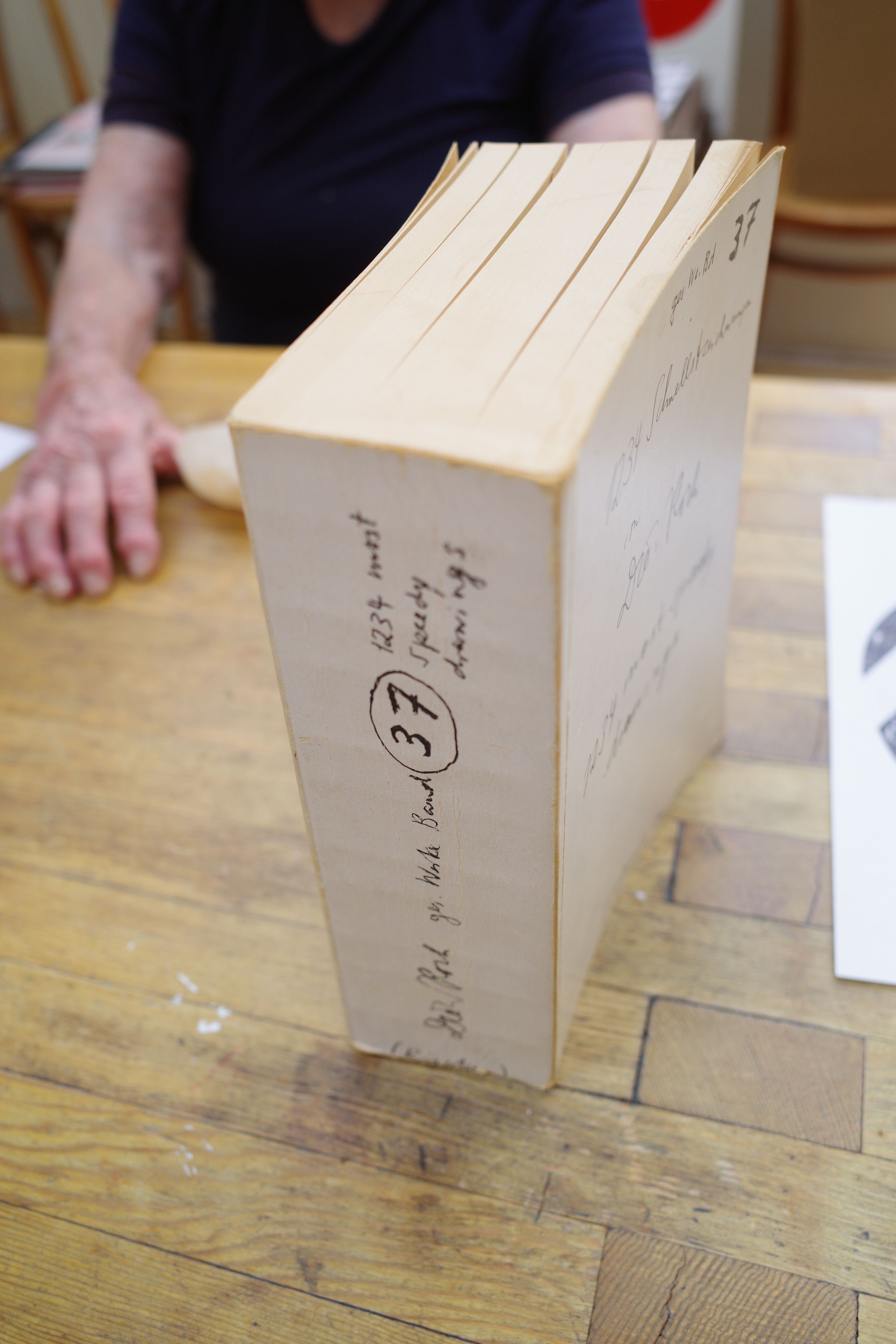
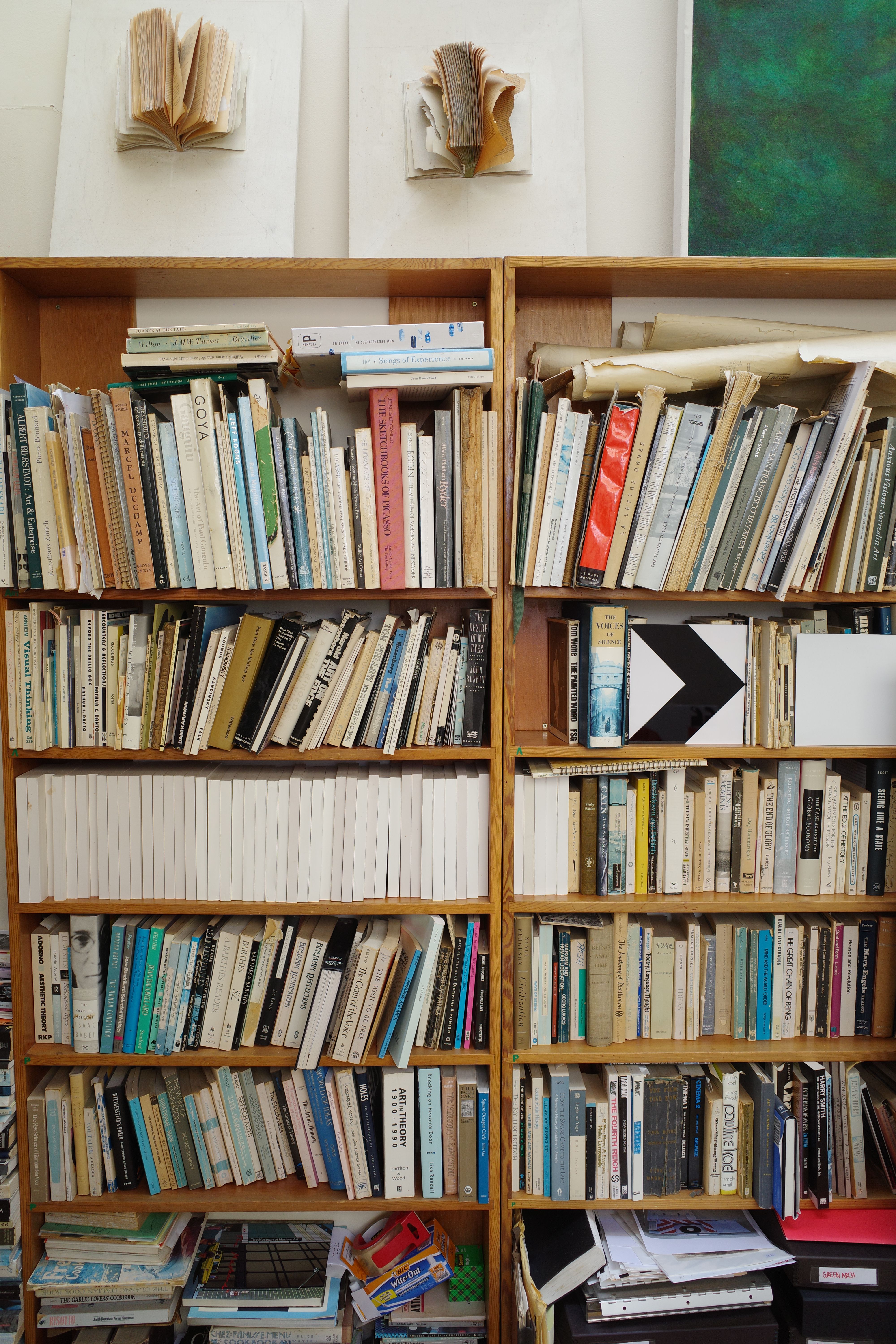
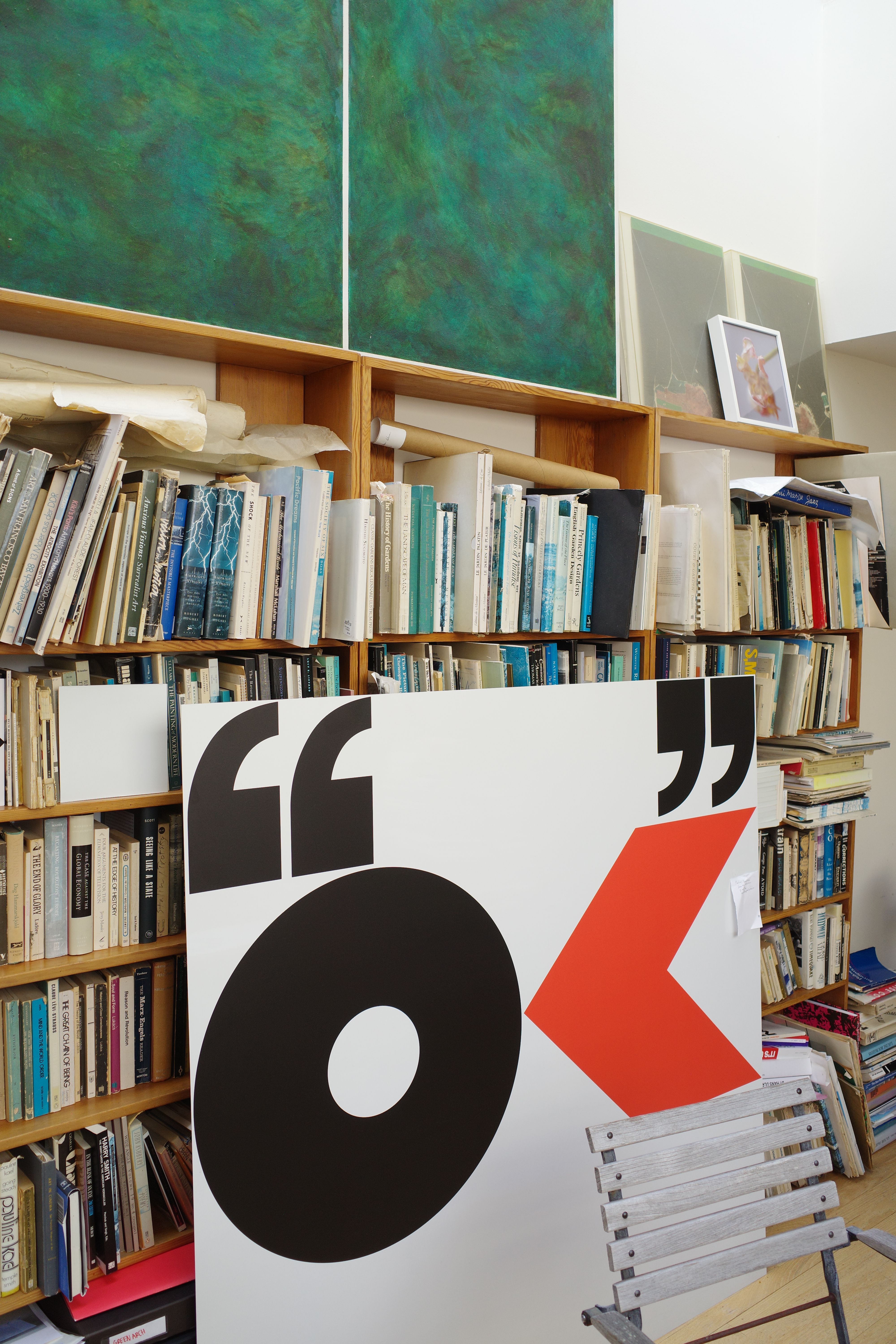
At the time of this article's original publishing via our newsletter, The Édit, Barbara was completing a large-scale commission at SFMOMA entitled Strips of Stripes, an architectural intervention featuring the newest iterations of her signature supergraphics, spanning walls and ceilings in response to the Mario Botta-designed structure. Despite her interest in the invisible realms, her work is strikingly bold, occurring at scales that defy the conventions of graphic design and ply at the limitations of the spaces they inhabit.
Barbara passed away not long after our conversation at the age of 95, a correspondence which would turn out to be her last in print despite having numerous interviews, podcasts and articles on her calendar.
She leaves behind an astounding (and visible) legacy in graphic design, visual art and publishing, and a potent point of view on the significance of the intangible.
Barbara's last book, The Invisible, can be purchased from Colpa Press, her publisher in San Francisco
For a more extensive biography, read Barbara’s obituary in the New York Times
Photographs courtesy Bobbie's late-life best friend and de facto studio manager, Éditions contributor Chris Grunder
