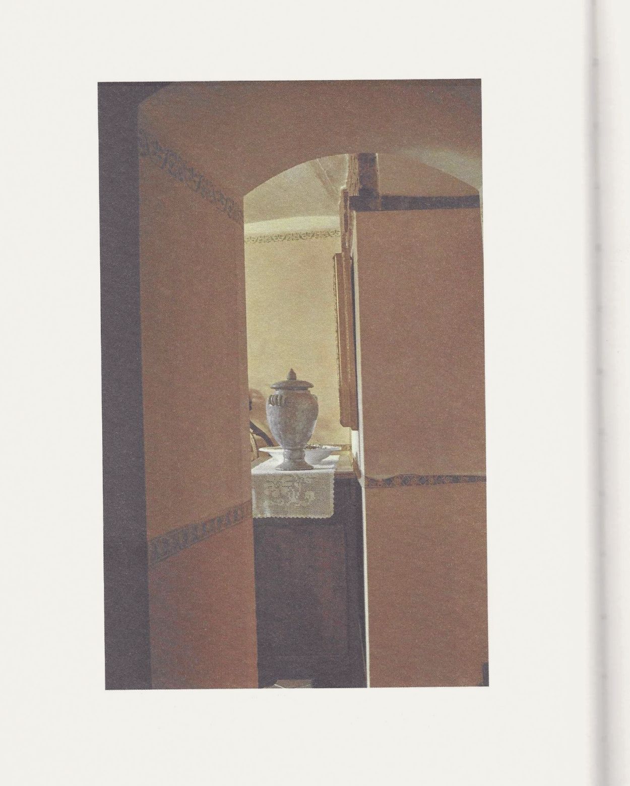
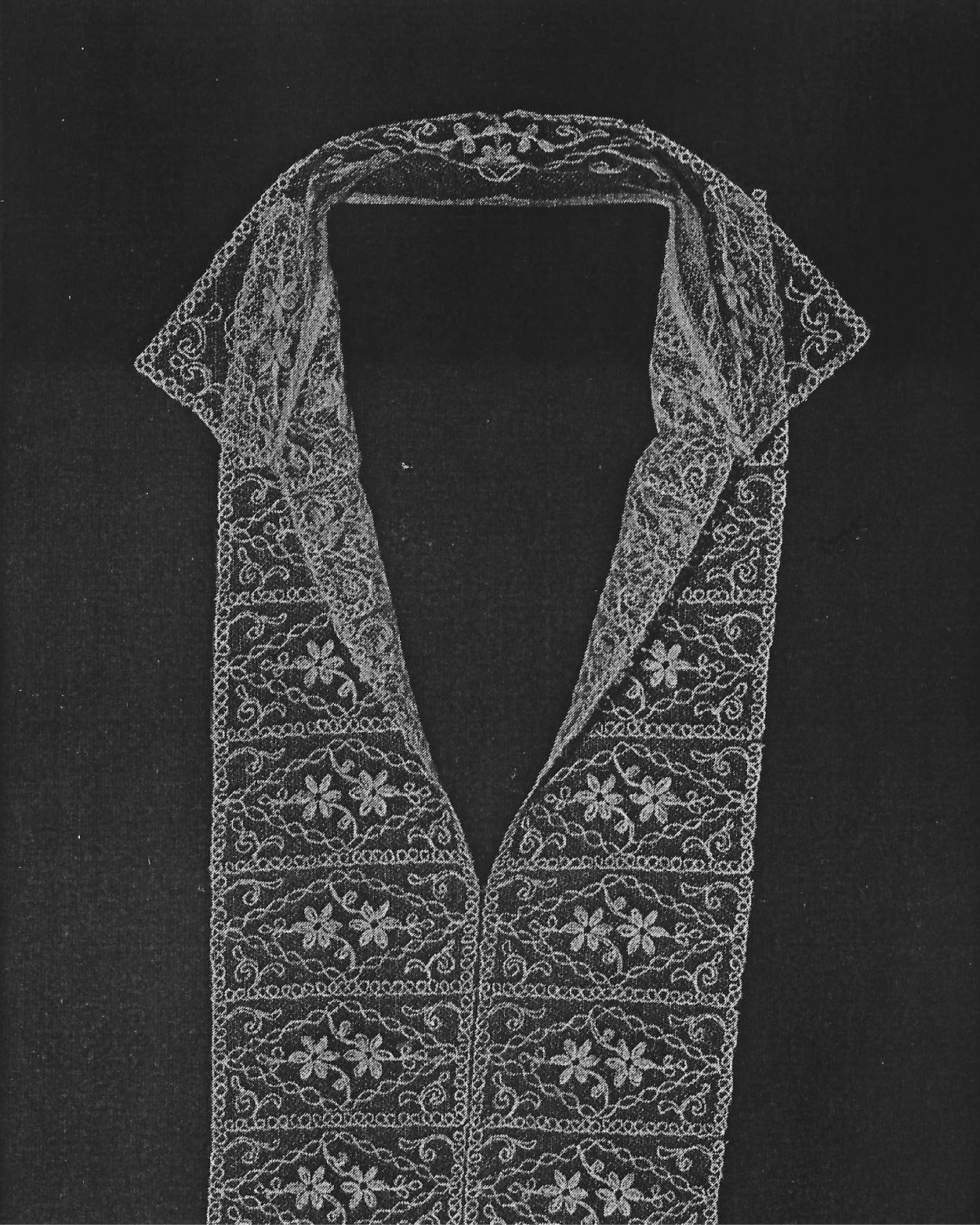
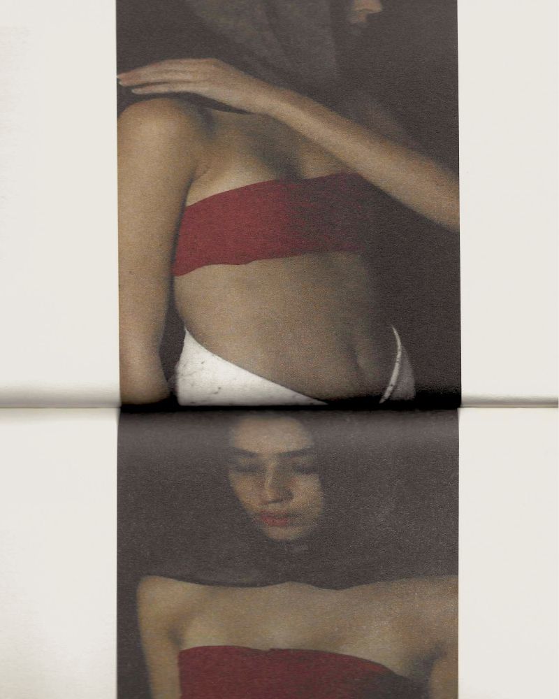
In conversation with New York photographer Jenna Saraco, designer Natasha Mead and editor Yasmine Ganely of ANYONEBOOKS on their new book, collaboration and their shared understanding of beauty.
What goes on behind the book? We sat down for a deep dive into the three-headed two-hemisphere creative process behind ‘ALTARS’ by Jenna Saraco, a new book out now on NZ-based upstart ANYONEBOOKS.
Working together with the vaunted duo of Natasha Mead and Yasmine Ganley, Saraco tells a century-long story of family affinities, ritual, personal history and culture.
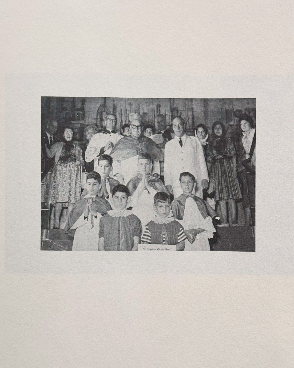
ÉDITIONS: So to start, ALTARS is inspired by a photograph of your father taken in the 1960s, pictured as a young altar boy on a family trip to Italy. What was your experience in encountering that image for the first time?
JENNA SARACO: We were moving my grandmother into the nursing home and clearing out her apartment, and we got all of her photo albums. Looking through, this image immediately stuck out to me. It captured so much of my family’s history, not just my father, but also my interest in textiles and lace, the outfits the women in the background are wearing, and the costumes the priests are wearing, my grandmother’s Italian heritage. It was a nostalgic encapsulation of all these things that really resonated with me.
É: There are lots of beautiful garments in the image, which I think relate to costume and materials your work. Did that inspire the project too?
JENNA SARACO: Yes—this photo was the spark that made me want to go on this journey.
YASMINE GANLEY: We didn’t actually see that picture until quite a way through the process of making the book, right? JENNA SARACO: Right, but it started here for me. I never imagined it would come together as a book, but I’m really happy that it did. It was a lot of piecing things together, figuring out what I was doing for an artist residency in Sardinia.
É: After finding a sort of spiritual ground floor, how did you go about generating more images for the book? What was the line of inquiry or feeling you were after?
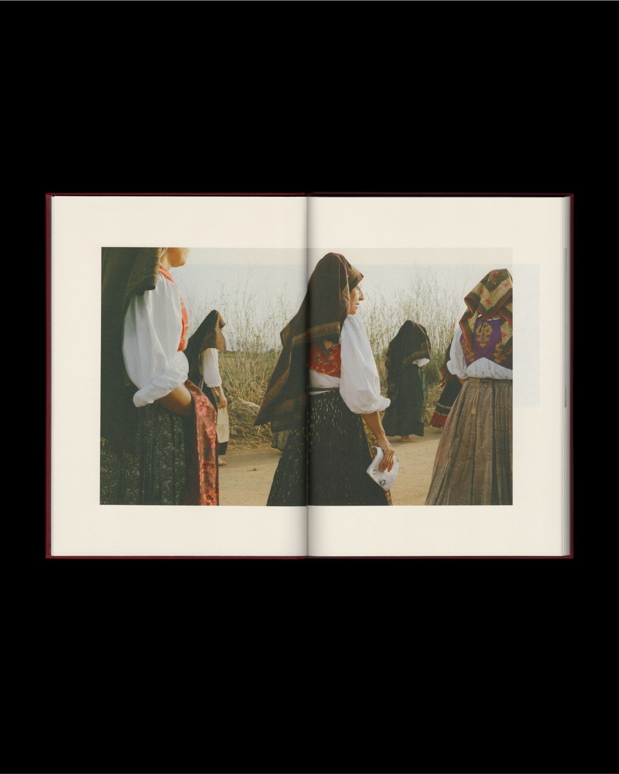
JENNA SARACO: The initial idea was to recreate some of these costumes in the images using found materials. I have a large collection of textiles from my grandmothers on both sides, as well as pieces from flea markets. I knew I wanted to create costumes or clothing elements from these materials based on the image. When I went to Sardinia and began the artist residency, the director pointed me to a town with a traditional religious ceremony held annually. It just so happened I would be there during that time. I was able to document that experience, and it became an initiation into their culture and history. That laid the groundwork for the rest of the images.
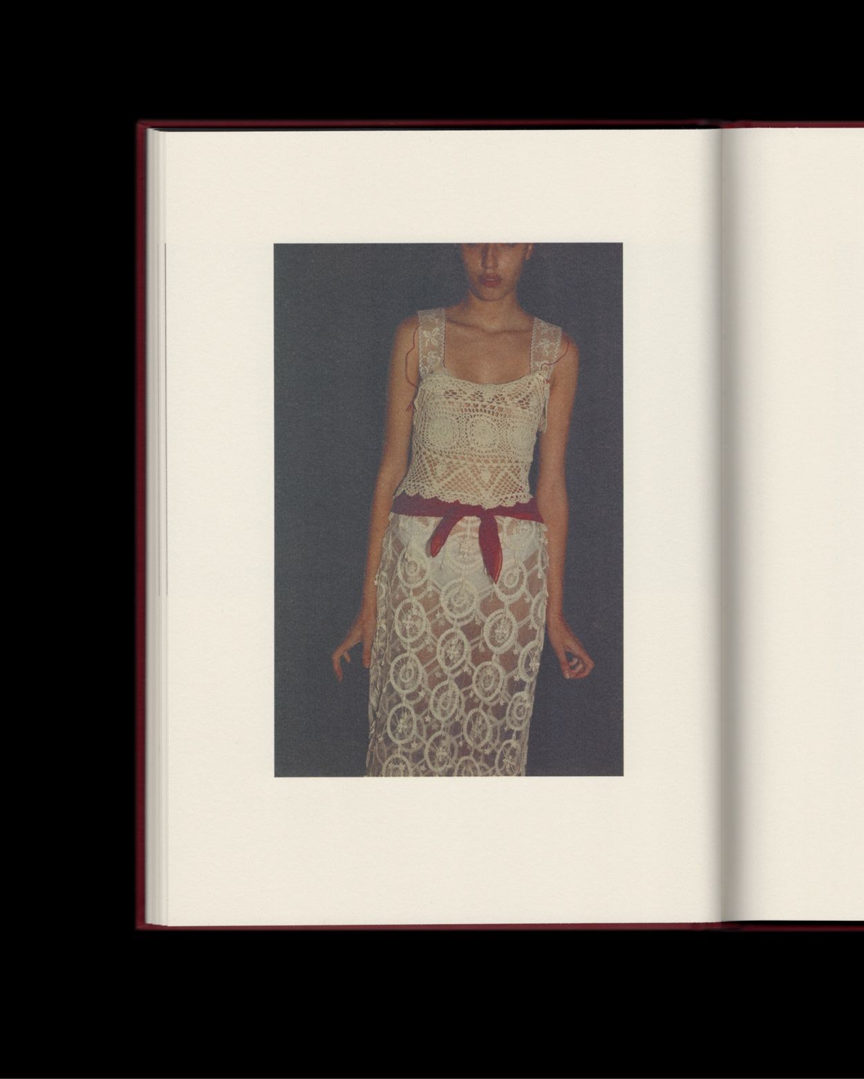
É: In the description of the book, you refer to it as a vehicle for communicating family history as much as personal style. So often the discussion around personal style starts and ends at aesthetics, for example wearing particular designers. For you, it seems like something deeper, more psychically-charged. You mentions you and your grandmothers' shared connection to fabrics, for example. That’s a lot of family history to lean into.
JENNA SARACO: Absolutely, I think it goes much deeper than aesthetics. Overall the book touches upon three very different things, all connected to heritage: cultural background, textiles, and my grandmother as an individual, whether that's through the costumes in the religious ceremony, the women in the ceremony representing a cultural past, the garments I created as a modern interpretation of that past, or the home of the grandmother I stayed with, which also embodied so much familial history.
É: Definitely beyond aesthetics. So, you created interpretations of these garments to photograph specifically for the book?
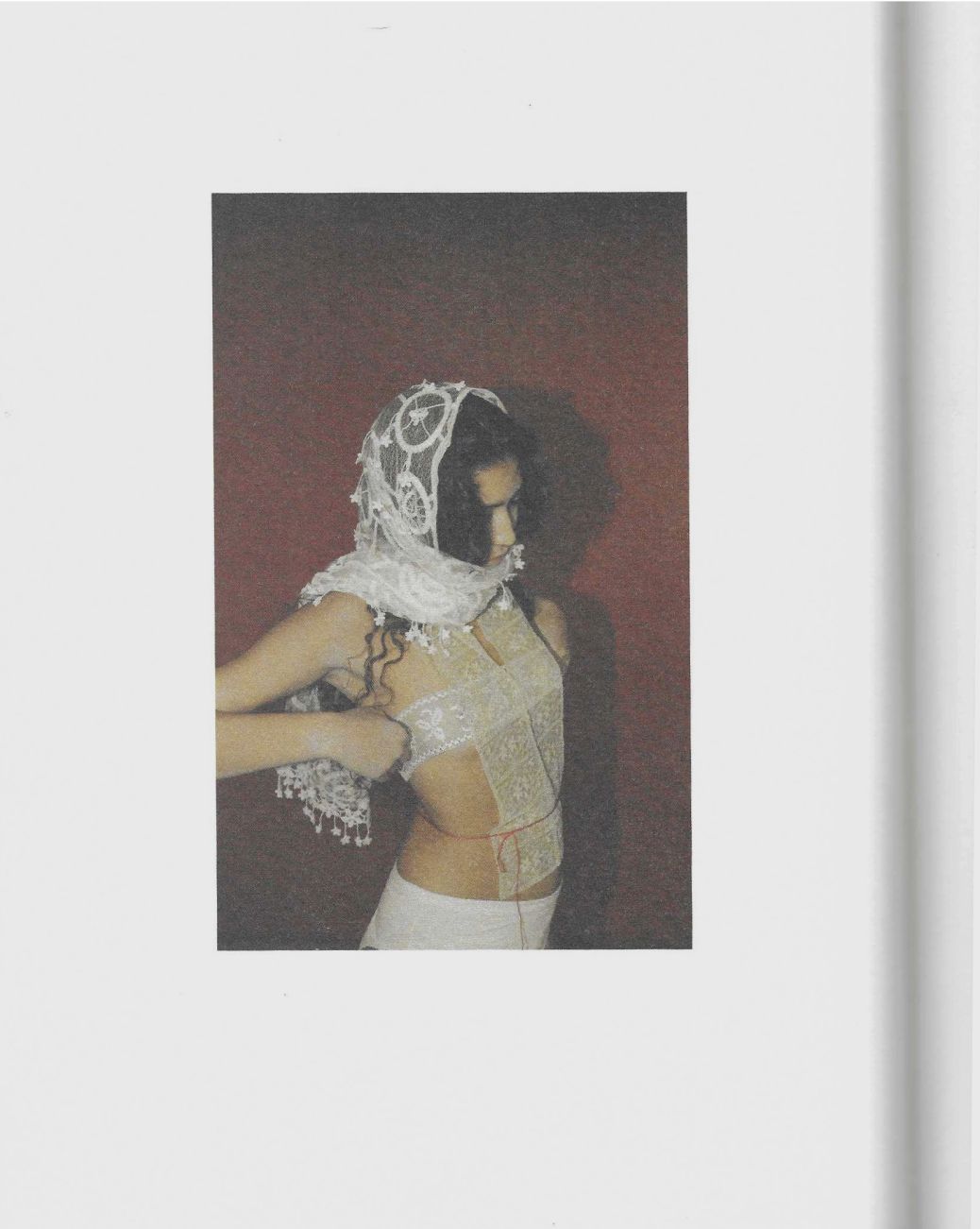
JENNA SARACO: Yes. In Sardinia, I worked for a few weeks creating interpretations of garments loosely based on the image of the altar boys, using lace, florals, and different materials.
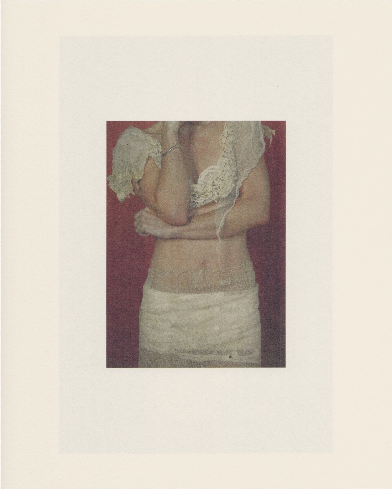
These elements were important for me to describe. There’s a section of the book where I’m draping fabrics to create garments. They’re not sewn or permanent, but they’re my interpretation of costumes.
É: Beautiful. Yasmine, how did you approach the editorial process together? Given such a strong underlying concept, was the sequencing about finding a narrative throughline, or was it more about creating a visual rhythm? Some of both?
YASMINE GANLEY: Like Jenna mentioned, there are clear sections within what she documented, and we played with different ways they could line up, exploring whether they were mixed together or kept apart. Ultimately, we decided to separate them into their respective sections:
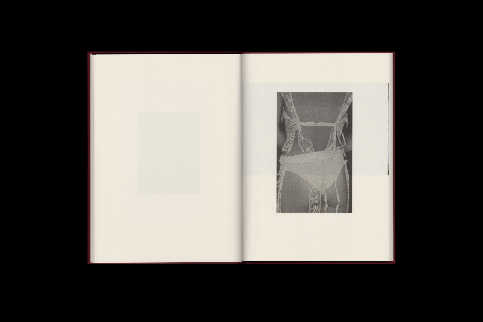
The first is the festival in Sardinia. The middle section features Jenna’s interpretations of the fabrics, photographed on herself and portraits of other women wearing these fabric pieces. The final section focuses on the interiors in Sardinia. It’s bookended by the Sardinian influence.
Natasha [Mead] also played a big role in this. We've worked together for over ten years, so our process is very collaborative. It’s not so much a Venn diagram as one big circle. Tash [Natasha] has a gift for finding harmony between narrative and visual poetry, allowing the images to stand alone while still contributing to the overall story.
That’s always an exciting part—when Natasha comes back with ideas, it’s like the images take on a new life. You have all the material, and then you throw it between the three of us, and something new emerges. It’s such a dynamic process, and I love that about our collaboration.
É: Each of you has such a distinctive vision of beauty and a particular sensibility around image-making and storytelling. What drew the three of you together for this project?
YASMINE GANLEY: Absolutely. I've known Jenna for a long time—we've been in each other's orbits for probably 10 years. I've always followed and loved her work. Jenna started sharing snippets of the project from Sardinia and moments on Instagram, and I messaged her ’What are these? They’re beautiful.’ The conversation naturally led to the idea that we should do something with this.
Once we realized it could become a book, we folded Tash into it. I think all three of us share a similar sensibility towards objects, beauty, and narrative, though the story feels like an undercurrent in the book—there's an element of show, don't tell. We wanted people to make their own connections through how the imagery is woven together. Our hope was for the experience to feel more intriguing than just a linear, step-by-step journey.
É: One thing I immediately noticed was the level of show-through in the paper stock. The soft layering of images, sitting above or emerging from behind each other—it feels like layers of fabric. The design is so intentional, not just in the order of images but the visual relationships between one page and the next. Could you talk about the thinking behind those choices?
NATASHA MEAD: You put that beautifully, and it captures a lot of what we were aiming for. Ultimately, we wanted to create a textile through-line—this materiality of fabric and how the different layers bleed into one another. That works on a literal tactile level, but also symbolically across time and history. The historic imagery, the modern interpretations, and the homes, all three distinct collections inform each other in sequence.
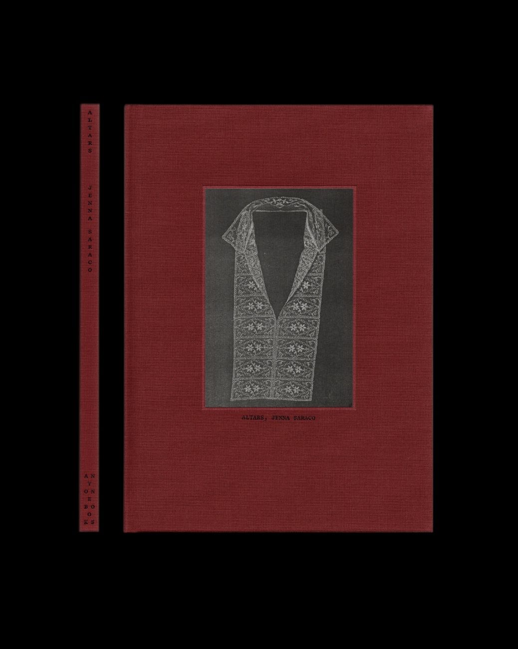
We also carried that idea into the book's binding. The stitch binding allows the spreads to lie completely flat, so you can see each image in full. You also get those moments where you see the thread literally coming through the page. The fabric-bound cover, with its burgundy red color, became a recurring motif drawn from Jenna's imagery.
É: You’ve basically covered my next few questions! It’s fascinating to hear how meaningful those choices were, and to see in real life how they subtly resonate with the book’s content.
NATASHA MEAD: I was surprised at how many people noticed those details at the launch, and how many commented specifically on the paper. I thought some might pick up on it subconsciously, but it was lovely to hear people mention how the paper contributed to their experience. I think it speaks to how much we long for those tactile connections in physical books. We're kind of lacking this in the way we absorb imagery on a day-to-day basis, it's definitely overload. In the book, these material choices really help to ground you in the experience of taking in images.
É: How did you determine the size and scale of the book? Did you know how you wanted it to feel in your hand or appear on a coffee table? Was it based on the size of the family photographs?
NATASHA MEAD: Choosing the size is sort of like a name, right? Once you've made the decision, so much naturally flows from there, but you almost don't want to decide too soon because then it’s like you're going down that path. So, we’re always trying to find a format that responds to the imagery; one that's going to give the imagery the room to breathe, where each photograph has a moment sitting on the page in conversation with space, other imagery on the spread, and even the imagery on the next page.
That said, there’s a certain size that you need in order to leave room for the eye, to feel that sense of spaciousness, but not so big as to lose the intimacy of the imagery, and of Jenna’s connection with the work itself. We worked to find a size that would create harmony between those two ideas.
É: You can definitely feel it as you leaf through.
NATASHA MEAD: We also structured the grid in the book to allow a lot of show through between pages, so there is a slight manipulation of the scale and ratio of the imagery in order to achieve that, but also keeping any changes to a bare minimum so that the imagery is as close to the moment that Jenna is looking through the lens and taking the photo—we weren’t going through and creating abstract crops, they’re really true to what Jenna's original images.
With portraiture, keeping it true to the original aspect ratio is extremely important. When it was more about Jenna's photos of lace or garments, it was more about responding to the object inside the image, where the the size and placement of the image is informed by what it contains.
JENNA SARACO: Right. Some of the images are scans, and some of them are from film, so there’s this a layer of process before they arrive on the page. The way the book is was put together—the size, scale, grid, binding, the red fabric—everything kind of lends itself really nicely to being an object on its own. I love objects, and I feel like that’s apparent in my work, or through the book itself. Treating a book as an object is a really intentional way of putting the work in the world
É: Right, we often talk about the dual life that books have as objects, and the presence they have in our spaces. How did you decide on the color of the linen cover?
NATASHA MEAD: Well, there’s a limit on what colors are available when you're working with actual physical fabric. I mean, you can actually print the color, but I quite like finding a fabric that actually *is* the right color because of the way that it retains its richness over time. We had a few options, but this deep red was almost like another thread that runs through the book. A lot of the imagery is monochromatic, but there are these appearances of rich color. The cover ties it all together.
JENNA SARACO: Yeah, the red color was definitely an intentional part of the process for me—I even sewed some of the garments using a red thread. It wasn't super apparent in all of the imagery, but it was something small that became a big part of the book. It has this resonance that feels like it’s reaching back in time a little bit too, kind of classical—it’s the right red.
É: Natasha, I think a lot of people are familiar with your branding work [LESSE, F. Miller, YU MEI, J. Hannah and many more], whether it’s through skincare packaging, websites, or more generally speaking, the elevated sensibilities that you bring to brands. It's very detailed and precise from a technical perspective, but also operates in the realm of beauty, pleasing without explanation. How does your approach apply to creating books? For example, with the color choice as a continuous thread, it almost feels like a signature identity element you might find in a brand.
NATASHA MEAD: The theme that runs throughout all the work that I am quite obsessed with craft; craft in terms of the material, craft in terms of typography, craft in terms of how objects are put together, whether or packaging or books, the tactility of print and how we connect with it, all the different layers of these things that are brought together. I always want to make to make something that feels distinct response to what it is that we’re creating in the moment, but that also feels like it’s following a thread back through design history. Design that resonates the most for me when you can feel the weight of things that have come before it. To be honest it’s quite instinctive so it’s hard to actually put into words.
É: You just launched the book here in New York. How was that?
YASMINE GANLEY: Even though we were creating this book over two countries and across many timezones, Jenna is living and working in New York with her community around her, and it felt like it made sense for her to launch her book there, and that we would come along and celebrate that with her.
We feel really lucky that we were able to use Maryam Nassir Zadeh’s store for the event, a designer who also has a deep connection to textiles in her work. The space was already filled with that energy, so it felt like the right place to be.
Being from New Zealand we didn't know many people, but it was so warm and everybody was so enthusiastic about what we’d made, and you know, Jenna’s family was there and it just felt really sweet. We were quite overwhelmed by the response. And, we sold out of all the books that we had on hand for the event which we totally didn’t expect!
É: Amazing. What’s next for ANYONEBOOKS?
YASMINE GANLEY: Our focus is sending ‘ALTARS’ out into the world. Next year we will probably have, another book or project on the horizon. But for the time being, this is very much our baby. This is definitely the kind of project we’ll continue to produce, books with artists who share our approach, growing ANYONEBOOKS as family over time.
